Plot High Low Line Chart
The High Low chart gives you a graphic view of the stock or equity in
question. The high, low and closing price are plotted for each week of history
in the selected history file in the top portion of the screen. The bottom
portion of the screen initially displays the volume.
The other two options for charting price information is the
Chart Stock Closing Price and the
Japanese Candlesticks
The visual display of the stocks will give another perspective of the stock.
What you want to look at here are the highs and lows. A pattern of higher highs
in conjunction with higher lows is representative of a higher trending stock, a
stock that is building strength. Whereas lower highs when combined with lower
lows represents a deteriorating stock. This chart may be combined with a number
of other studies to get a better perspective of the price and volume action.
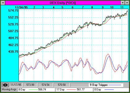
The OEX Chart below also contains the MACD indicator.
Back to Stock Indicators
|